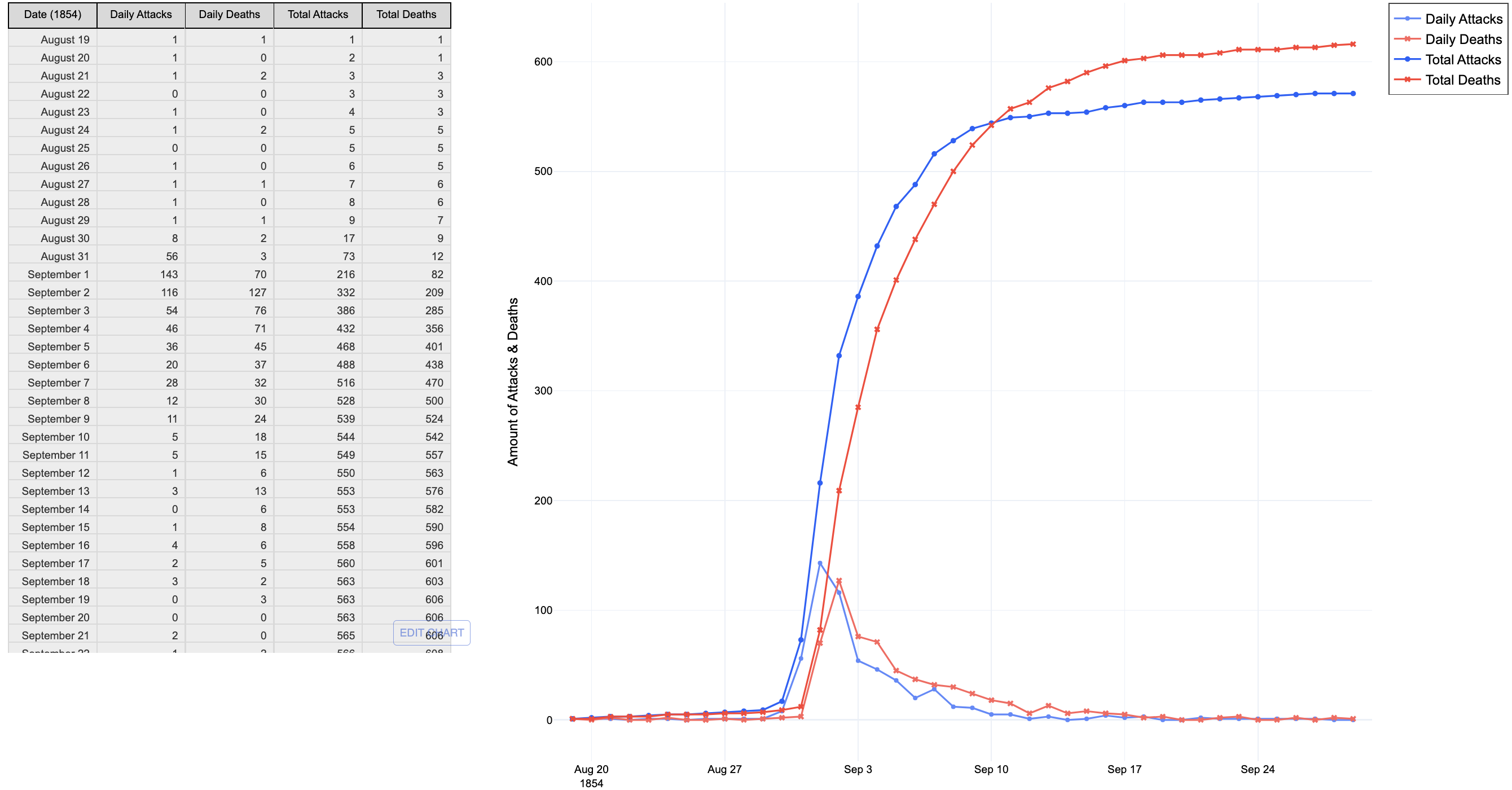
Cholera Visualization

Summary:
The Cholera Project (Project 1) is a data visualization of the 1854 London Cholera Outbreak, Naples Outbreak, and the 1851 UK Census of Gender Population Distribution. Using Dash/Plotly, the visualization reads from CSV and TSV files to display each chart (bar, map, pie, table) for readers to understand the whole picture of the Cholera Outbreak. To view the entire visualization, see Cholera Visualization.
Cholera Project Experience
ICS 484 (Data Visualization) gave me a first-time experience with Plotly. After repeatedly reading the documentation and lecture slides, I began understanding the workflow. Reflecting on the Cholera Project, I identified ways to improve and enhance the visualization while also becoming more efficient.